Campaigns & Multi-Channel Ads
The goal: Carry a single concept across formats while keeping tone and voice consistent. This campaign began with an illustrated comic-strip handout that echoed a video storyline, then expanded into billboards, transit ads, social graphics, and display ads—all part of one visual system.

Comic Strip Handout
Art Direction | Layout
The challenge: Introduce a new initiative without photography and create a static piece that could carry forward the tone of the video.
My solution: I designed a comic-style handout in newsprint, using illustration to translate the story in a way that felt human, clear, and approachable. This piece set the foundation for the rest of the campaign.
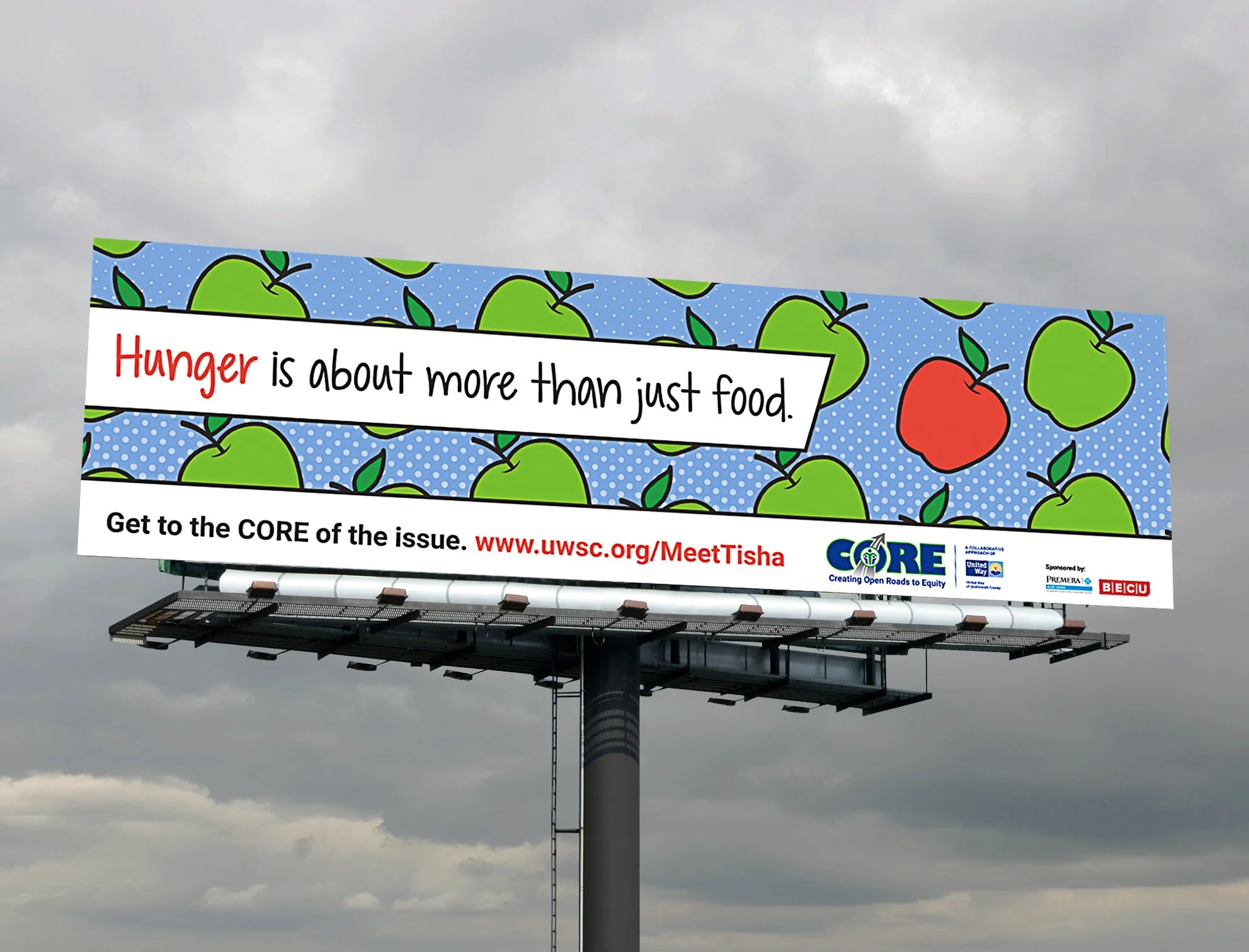
Billboards
Design | Layout
The challenge: Translate the handout’s themes into bold outdoor messaging that would stand out in high-traffic areas.
My solution: I designed billboard visuals that drew directly from the comic strip, including the apple to represent food. The clean, high-impact layouts reinforced the message at scale, sparked curisity, and directed audiences to a custom landing page.
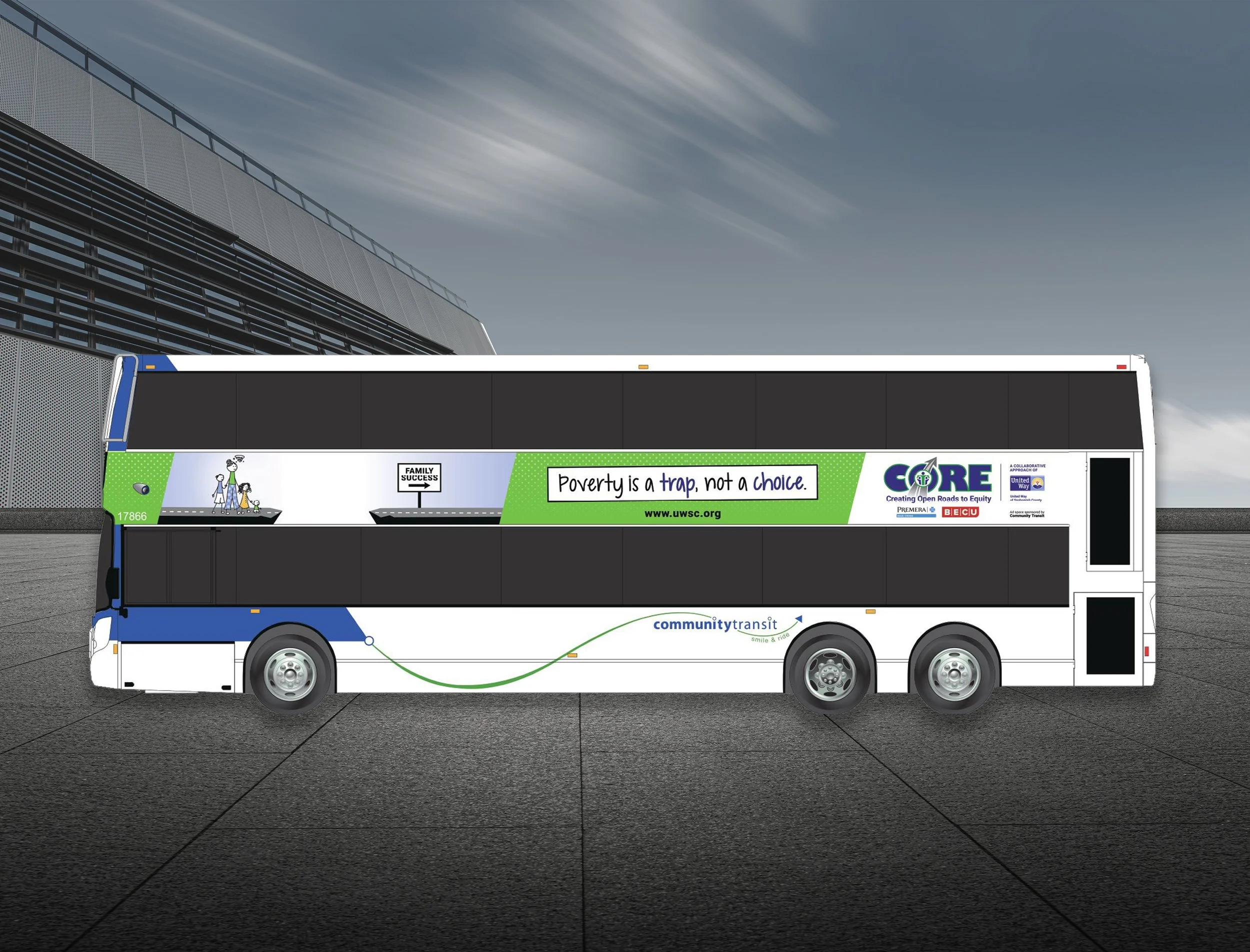
Transit Ads
Illustration | Design | Layout
The challenge: Create a visual that illustrated the campaign tagline “Poverty is a trap, not a choice” in a way that commuters could understand in just a glance.
My solution: I designed transit ads that boiled the concept down to a single, powerful image. I created illustration and layout treatments optimized for quick readability on double-tall buses along the Seattle–Everett corridor. The ads maintained a direct visual connection to the comic strip and billboard designs, reinforcing the campaign as a cohesive whole.