
Example Project
International Brotherhood of Electrical Workers (IBEW) Local 332’s Newsletter Magazine
IBEW Local 332, based in San Jose and serving the heart of Silicon Valley, produces a quarterly news magazine to keep this trade union’s members informed, connected, and engaged. Each issue brings together updates from across the union—from major job sites to apprentice and member spotlights—requiring a layout that can support a wide range of content while remaining clear and easy to navigate.
To support this, I developed a more robust publication template system designed to bring consistency, flexibility, and efficiency to the production of future issues.
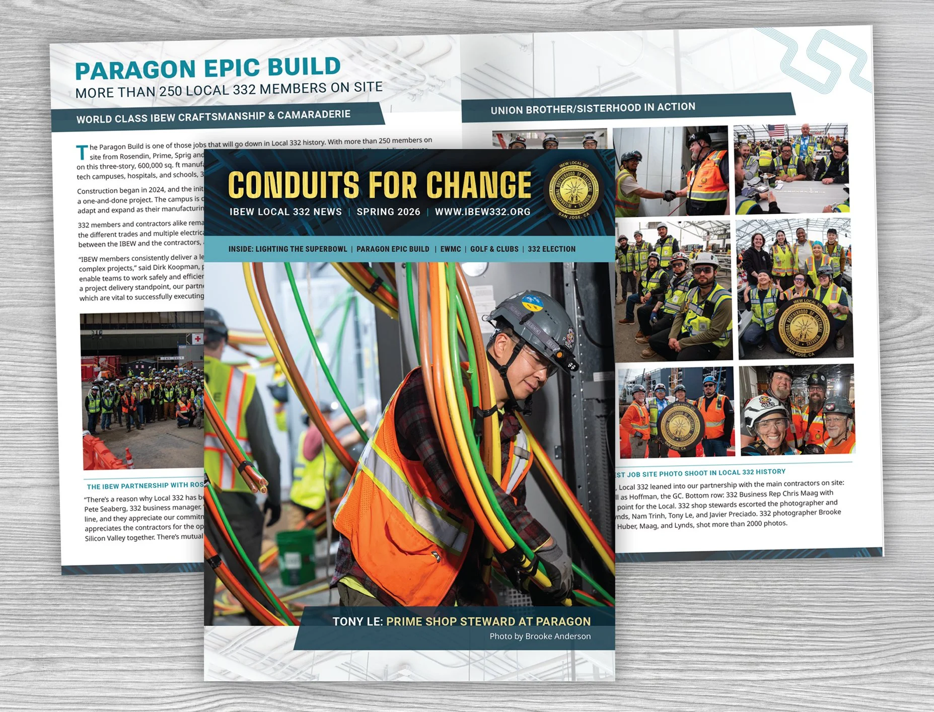
The “After”: Spring 2026 issue using my updated publication template
The “Before”: IBEW’s original design
The Challenge
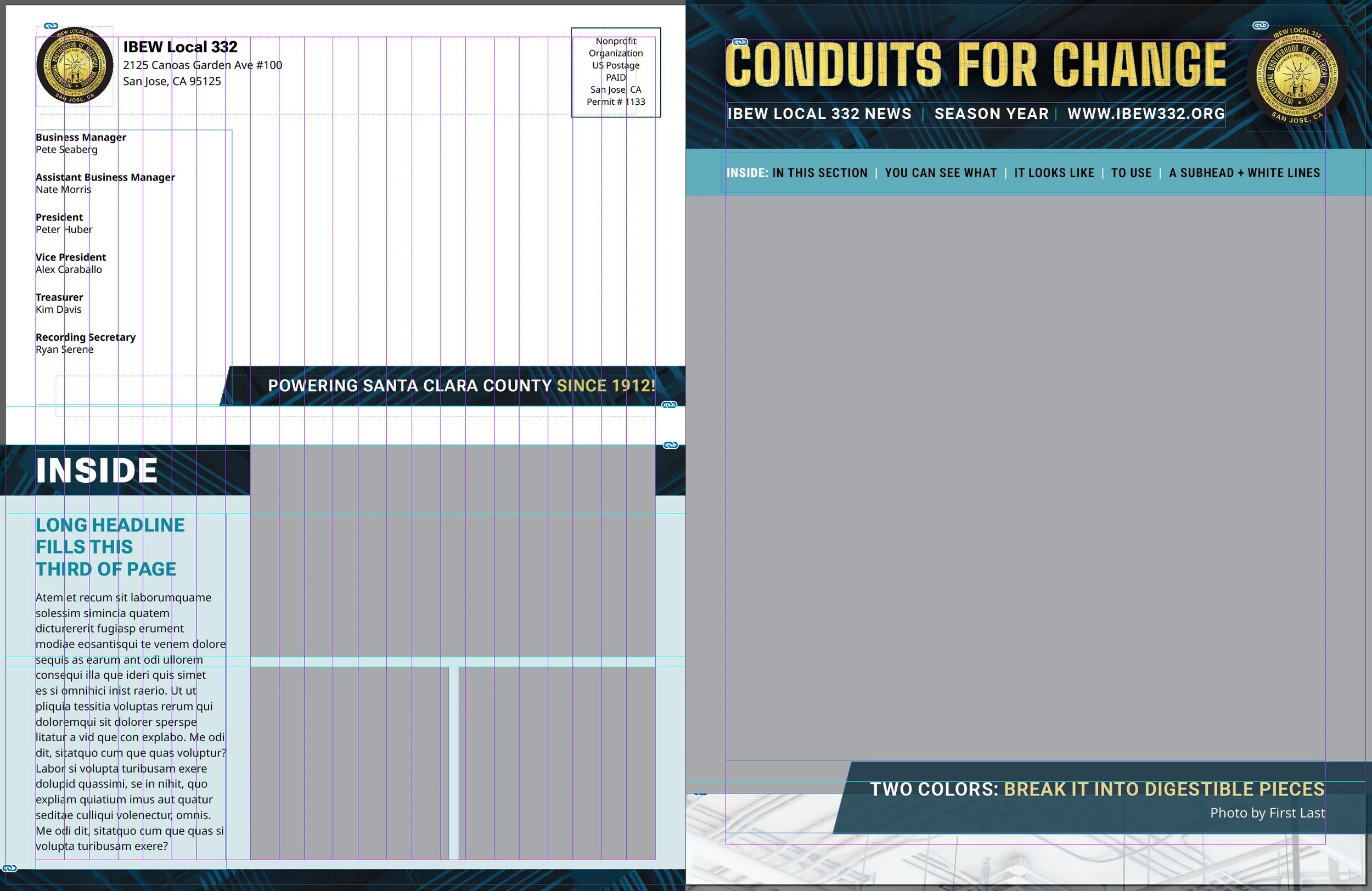
The existing publication relied on a basic InDesign template, but over time it had become less consistent and more difficult to use. Styles had drifted, and layouts often required manual adjustment rather than being driven by master pages and a clear grid system.
The visual direction also no longer matched the level of sophistication of the work being featured. With members building complex, high-profile projects, the communications lead wanted the publication to feel equally current and state-of-the-art.
The challenge was to create a more structured, flexible system that could support a wide range of content while maintaining familiarity for readers.
Template Before
Template After
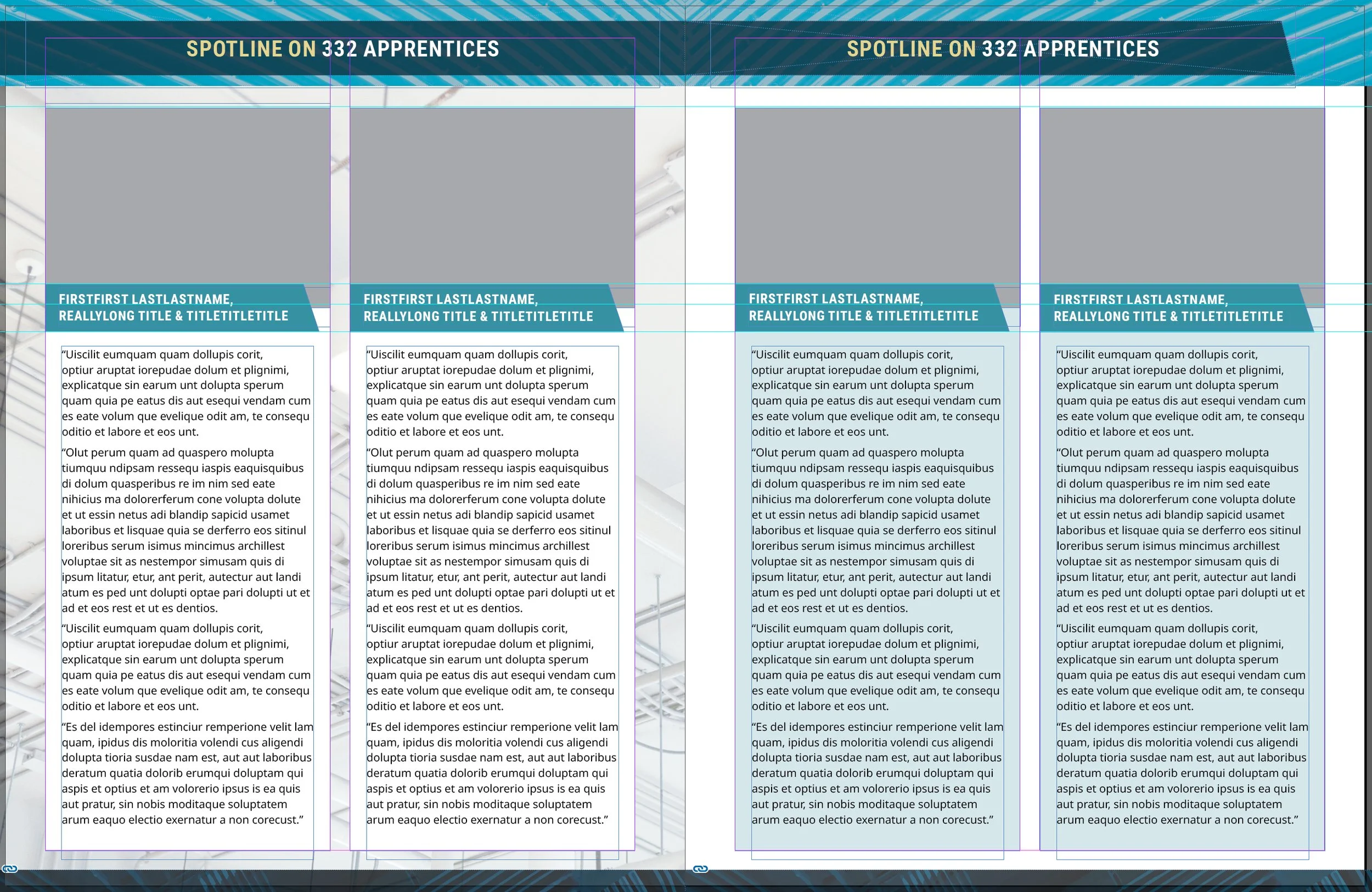
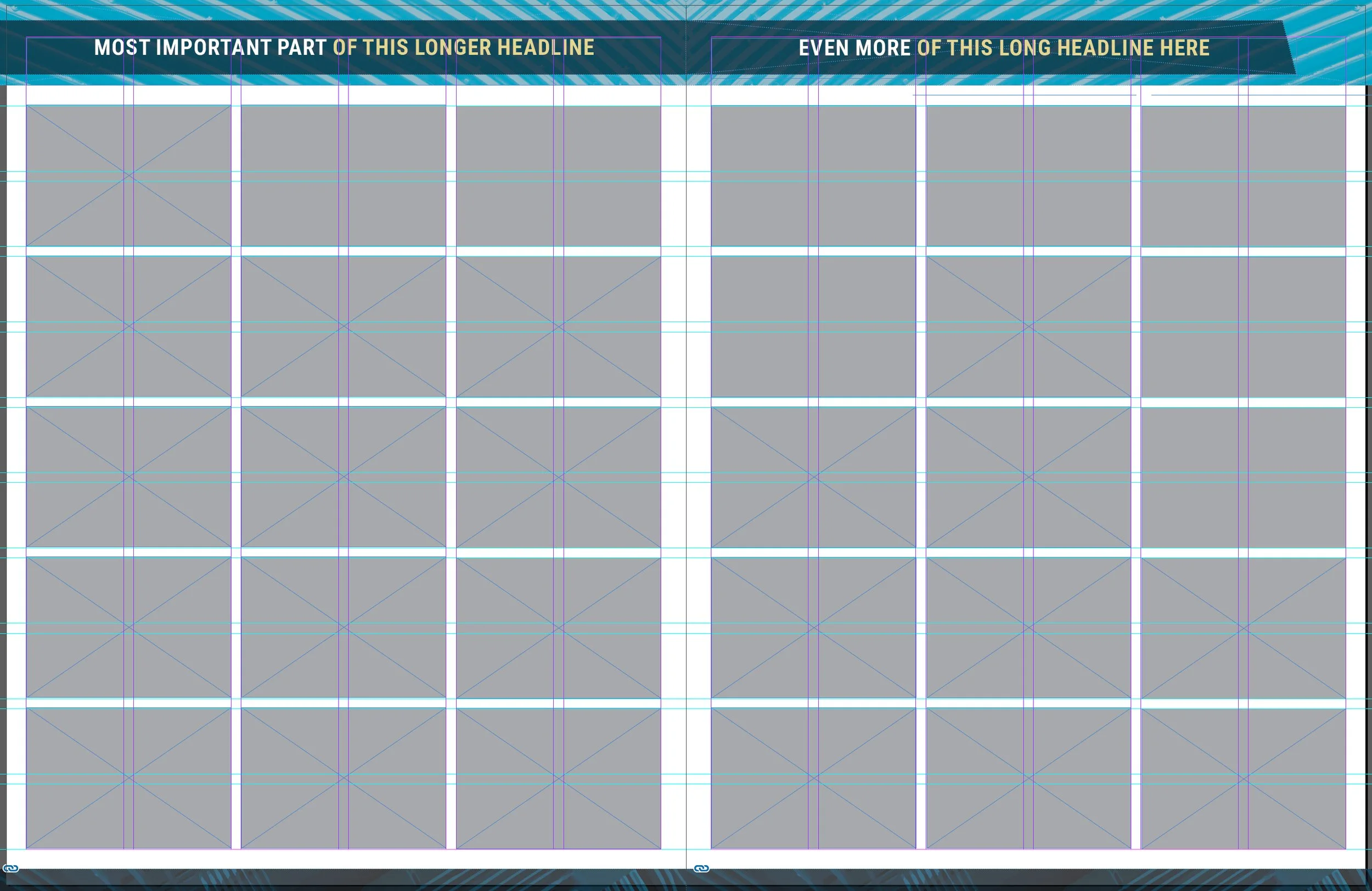
From Simple Template to Modular System
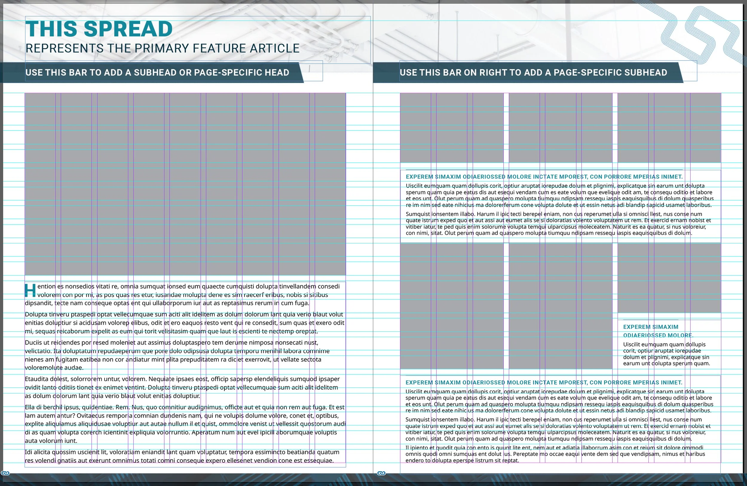
My update introduced a more defined framework for building each issue in InDesign, with a consistent grid and a full set of paragraph, character, and object styles guiding layout decisions instead of relying on manual adjustments.
At the same time, the visual direction was brought forward to better reflect the work being featured. The masthead and typography were refreshed, and the palette shifted from heavy beige to a more intentional use of gold, drawn from the logo.
A conduit pattern from the masthead was extended throughout the publication to create a unifying visual thread, grounding each page. Increased white space and more deliberate spacing gave the layouts a lighter, more open feel, aligning the publication more closely with the high-tech environments the members work in.
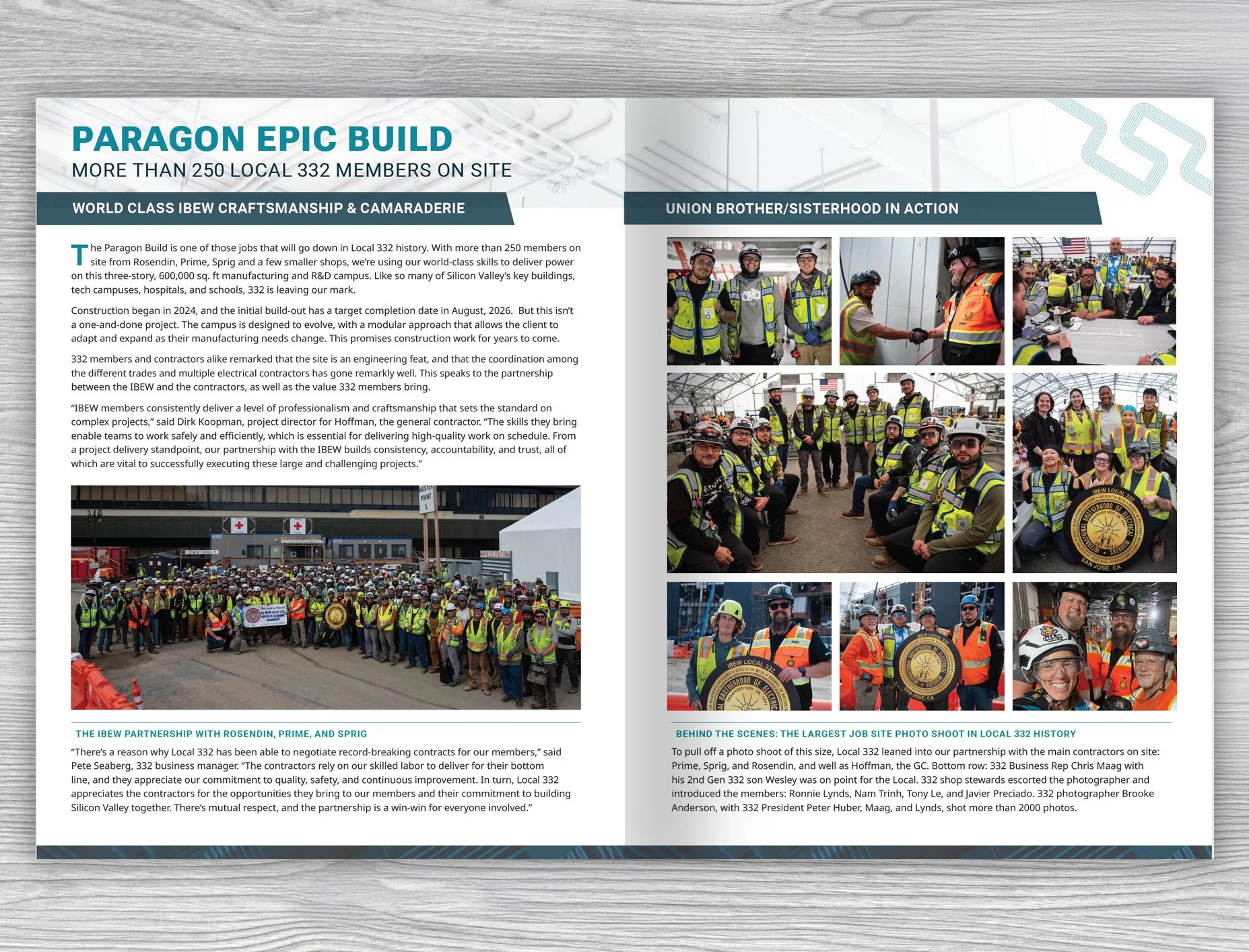
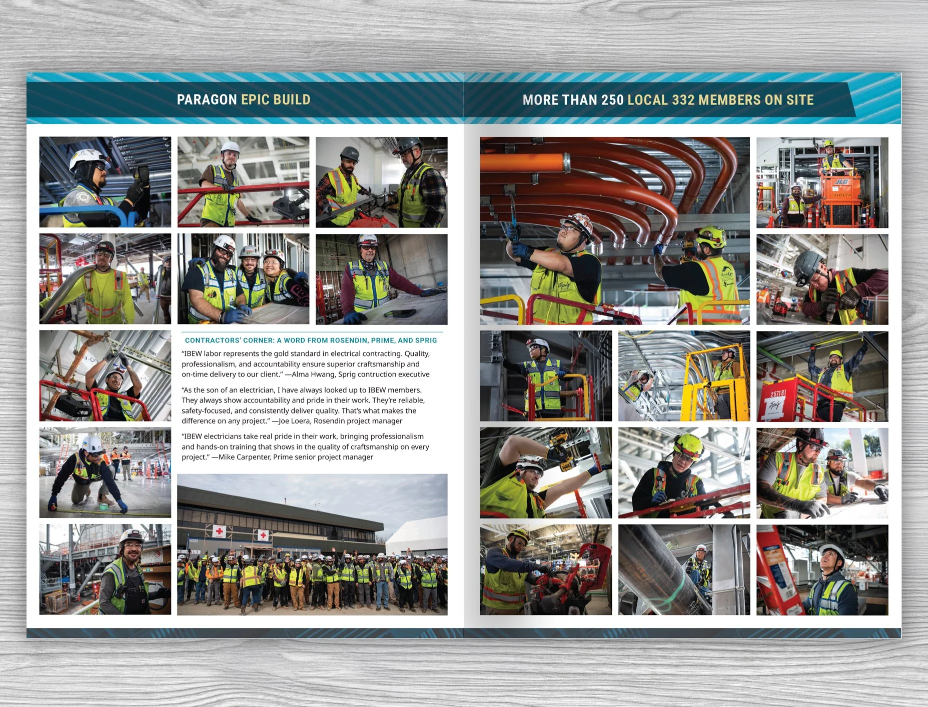
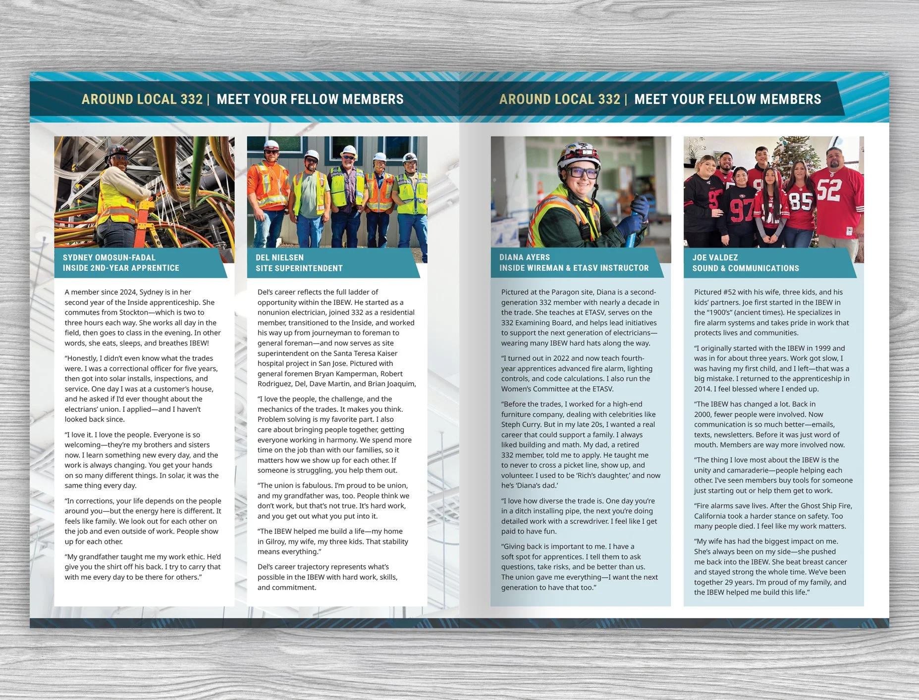
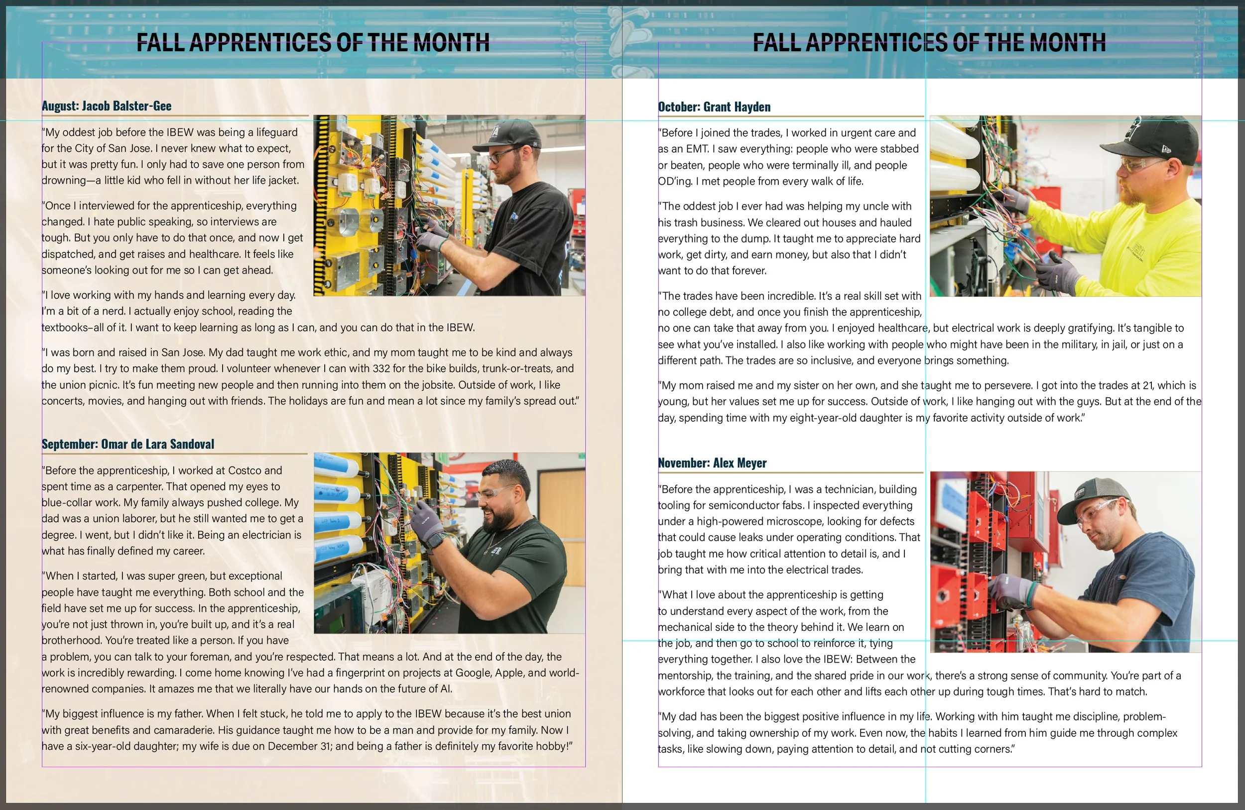
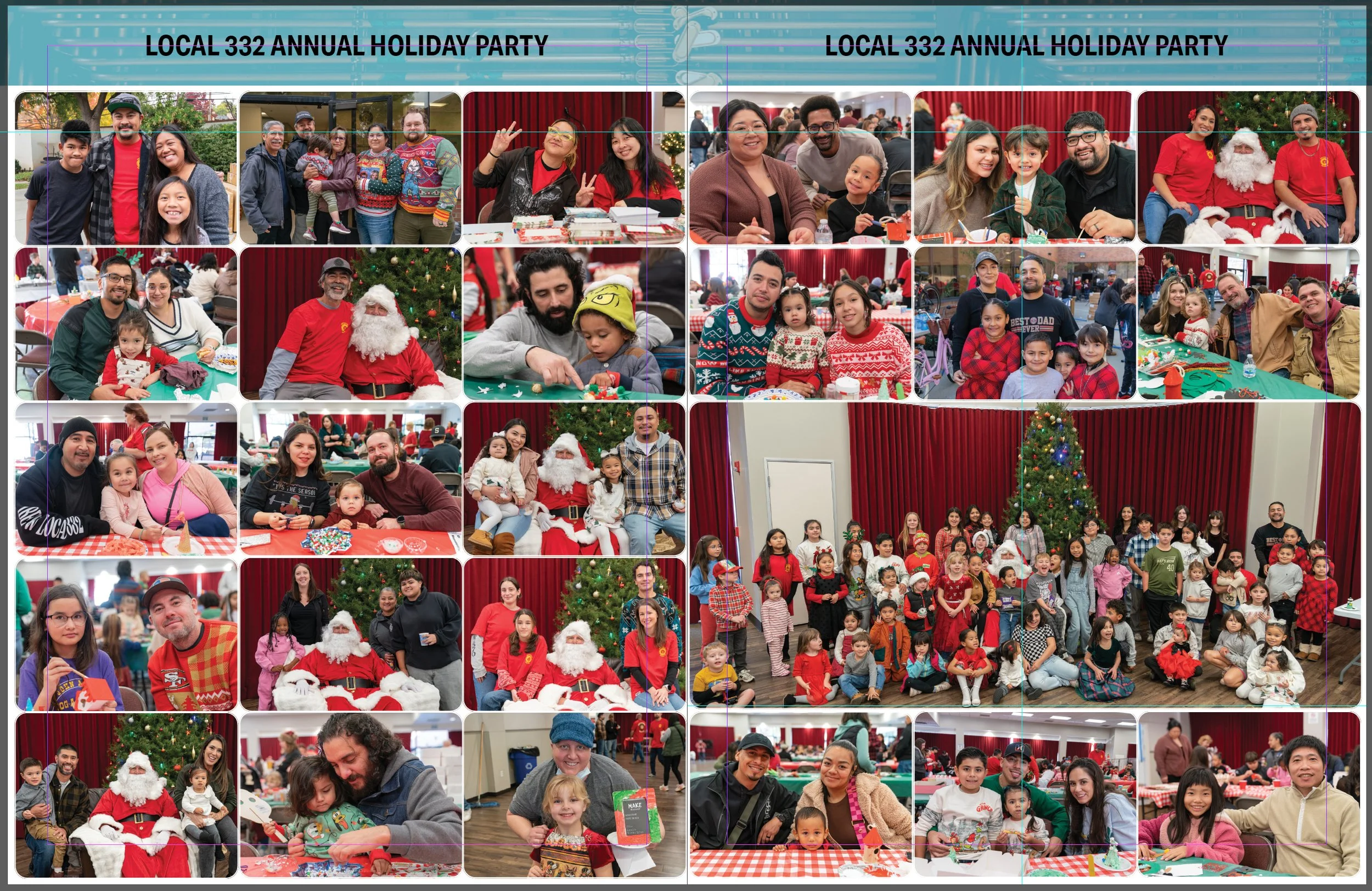
The real world application: actual Spring 2026 issue using my updated publication template
Real World Impact
The updated template provides a more reliable foundation for producing each issue, making it easier to build pages quickly while maintaining a cohesive look throughout the publication.
The system supports a wide range of content—from feature articles to image-heavy spreads—without requiring custom layouts for each page. As a result, the communications lead can focus more on content and storytelling, with the structure already in place to support it.
Visually, the publication now better reflects the level of craft and professionalism of the work it represents, creating a more current and engaging experience for members.
The response to the updated template was very positive. The communications lead described the system as a joy to work with, and the office manager shared that he loved the new direction—an especially enthusiastic response that reinforced how well the update landed.